If you’ve been creating lots of designs and listing new products for sale, that’s awesome! But what if no one is buying your items?
This is super frustrating and can leave you scratching your head about what you’re doing wrong.
Sometimes, with your own business, you get too zoomed in and can’t see the issues that prevent shoppers from buying from you.
In this post, I want to help you zoom out, so to speak, and go over some of the most common reasons why shoppers aren’t buying your stuff and what you can do to make daily sales on Etsy and Amazon.
Let’s take a look…
I’ve made a video, then we have more text with different explanations below!
Your fonts are unreadable
If your text-based fonts are hard to read, it’s going to be a turnoff to customers.
There are so many products available on Amazon, Etsy, and eBay so you don’t want to give customers any reason to scroll past your listings. And if they can’t immediately read what your phrases say, that’s reason enough to continue scrolling.
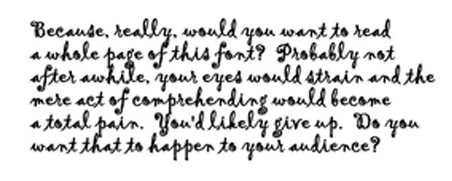
Check out the hard-to-read font below:
If your product included a text-based design with this font, shoppers would likely scroll right on past, as there’d be a decent chance they couldn’t read what your design said.
In my experience, I’d suggest steering clear of decorative and script fonts and sticking to those that are highly readable, such as the following:
- Georgia
- Helvetica
- PT Sans and PT Serif
- Open Sans
- Quicksand
- Verdana
- Rooney
- Karla
- Robato
- Ubunto
- Lato
- Futura
- Merriweather
- Calendus Plus
- Montserrat
- Fritz
- Adamina
- Pluto Sans
- Helvetica
- Margot
- Franklin Gothic
Your designs are too fancy
The Low Hanging System is called low hanging for a reason. The entire process is meant to be as easy as possible, and that includes your designs. So keep them simple.
If a lot of your designs have images, more than one font, and/or multiple colors, you’re making them too complicated.
Every single new element you add to your designs gives shoppers a reason not to like them. The simpler your designs are, the more widespread appeal they’re going to have and the more sales you’re going to make.
Say, for example, you create a design using three different fonts and three different colors. What if some shoppers don’t like the cursive font you chose and others don’t like the color blue you added? You don’t know how many Amazon and Etsy sales you’re missing out on because someone doesn’t like one of your design’s extra elements.
Most people find simple, readable fonts and the color black appealing. But when you branch out and start getting too fancy, you risk creating designs that fewer shoppers like. Your goal is to create designs with mass-market appeal.
Your phrases are hard to understand
Again, you want to make your designs appeal to as many people as possible. And while a certain phrase might make sense to you, you have to put yourself in shoppers’ shoes and ask yourself if it’ll make sense to them as well.
Especially when it comes to humor, which is very subjective, you have to consider how widely appealing a design’s potential is, even if you’re targeting a specific niche.
With each design you create, you need to ask, “Will the majority of people understand this, will they ‘get’ it?”
It’s fun coming up with funny designs that make you laugh. And if you want to list certain designs just for fun or as an experiment, then go for it! But for the majority of your inventory, you want your designs to have more widespread appeal.
You always need to keep in mind that as shoppers scroll through Amazon or Etsy, they have tons of products competing for their attention. So it’s important that they immediately ‘get’ what your design says and means, because they aren’t going to sit there trying to decipher it.
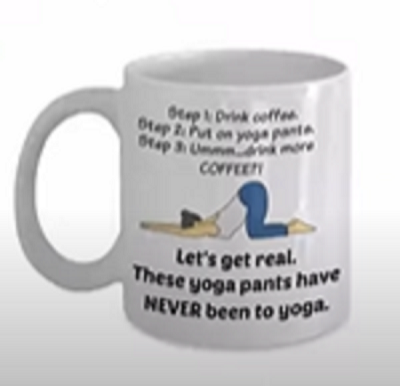
Here’s an example of this type of mistake:
I know this image isn’t super clear, so here’s what the mug says:
Step 1: Drink coffee
Step 2: Put on yoga pants
Step 3: Ummm…drink more COFFEE!
Let’s get real.
These yoga pants have NEVER been to yoga.
First of all, there’s too much text here. That’s a lot of reading for shoppers to do, and the reality is, they probably aren’t going to bother.
Secondly, the phrase leaves you scratching your head a bit. It isn’t immediately understandable. It’s a bit too complicated and wordy.
Plus, “funny yoga pants mug” isn’t a phrase that many shoppers are searching for (I’ll talk more about choosing the right keywords and niches for your products a little later on).
There isn’t a lot of interest in your niches
As you create new designs, another question you need to ask yourself is, “Are there specific groups of people searching for this type of product?”
You want to come up with designs with specific niches or shoppers in mind.
Platforms like Amazon and Etsy act as buyer search engines. People search for things like “lacrosse mug” and “mug for girlfriend” so you want to offer items that give shoppers what they want.
Generally, people don’t search for abstract phrases or niches. So even if you create a design that’s really funny, witty, or poignant, if no one is searching for that phrase or niche, no one is going to find your item to buy it.
So, usually, you want to cater your designs to niches you know people are interested in.
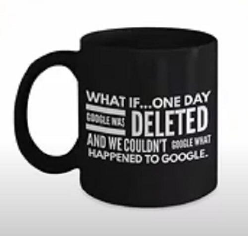
Here’s an example of this type of mistake:
The phrase says…
What is one day Google was deleted and we couldn’t google what happened to Google.
While this phrase is clever and easy to read and understand, you also have to ask, “What would someone search for to find this mug, and would that be a popular search?”
I don’t foresee many people searching for things like “Google deleted” or “what if Google was deleted.” Those just aren’t popular enough search terms. So even though the design looks good otherwise, if no one is searching for it, it’s not going to sell well.
So try to think like a shopper and create designs for specific niches that people are interested in — for example, college football, guitar players, or gifts for a girlfriend.
You don’t sell in enough niches
A big part of the Low Hanging System is throwing spaghetti at the wall to see what sticks. You want to have as many designs as possible but you also want to create designs for a bunch of different niches, especially when you’re just starting out.
For example, if you have 1,000 listings but your listings are essentially the same 50 designs applied to 20 different niches, then you really have only 20 designs.
As you first start to build your business, I don’t recommend creating a bunch of designs for one or two niches. Rather, I’d suggest testing lots of niches to see where you get the most sales. Then, once those sales start coming in, you can dig in and create more designs for those niches that have been selling well for you.
If you need some new niche ideas, check out my master list here: http://rachelrofe.com/masterlist.
You don’t use keywords in your titles
As I mentioned earlier, you want to create designs that cater to specific niches and/or groups of people. And you should put those keywords into your listings’ titles.
You don’t need to overthink this or do tons of research. To improve your listings’ page rank, you just need to make sure to do it.
For example, if your product has a funny knitting design on it, put the keyword phrase “funny knitting mug” in your listing’s title. Include whatever you think shoppers will type into the Amazon and Etsy search bars to find your product. Again, to get the best results, you need to think like a shopper.
People aren’t searching for your keywords
This relates to what I talked about earlier in terms of choosing niches that people are interested in.
You first need to choose good niches. But then, you also need to choose the best keywords to add to your listings for those niches, because even if you choose really great niches, if your listings don’t include keywords that shoppers are actually searching for, they aren’t going to be found.
As I mentioned before, you don’t need to overcomplicate this. Just think like your customers and include keywords you think they’d be searching for.
I hope you found this post useful! If you have any other advice to share about how to improve your Amazon and Etsy sales, leave a comment below. And if you enjoyed this post, please consider sharing it with your followers!




6 thoughts on “4+ Reasons why people aren’t buying your products (and what to do about it fast)”
rachele, I signed up for your program right before I went into the hospital for my leg and back. I’m currently out of the hospital and wanting to get started on the program. However, I can’t find the program and am getting frustrated looking for it. Could you resend the program outline and whatever else will help me. DD77751@yahoo.com. Donna doran 36 cherry lane kerrville tx 78028 541-777-9080. sorry for the “yelling” but my computer is giving me a lot of trouble today (July 15, 2022)
Hey Donna, You can check out the webinar to learn more here: https://lowhangingsystem.com/ Hope you’re feeling better!! Thank you!
Thank you Rachel! Happy birthday, enjoy your time!
Thank You this Info was helpful
Awesome info….thanks rachel
Great info thanks