A website’s “About” page is often one of its most visited pages. Especially when people first come to a site, they want to learn more about it – what the site does and what it stands for.
Your About page serves as a significant traffic-getting opportunity. It’s where you can begin building connections and trust with your audience. So you don’t want to neglect its content.
People want to learn about your products, of course. But they’re also curious about you and your brand. They want to know things like…
- how you got started
- what makes you special
- what your values are
- why they should do business with you
The About page is where you can share your unique story and get people to emotionally invest in your business. And if you don’t have your own website, you can make an About page on Etsy and eBay.
You can’t currently do this on Amazon. But if you enroll in Brand Registry, you can use the Enhanced Brand Content feature to tell your brand story in your product descriptions using enhanced images and text placements.
You can write whatever information you think is most relevant on your About pages. But if you’re stuck on what to say, below I offer eight tips on how to write a compelling About page that will help you attract and maintain more customer relationships.
Let’s take a look…
1. Highlight your business’ unique value proposition (UVP)
First off, what exactly is a unique value proposition?
Your UVP is what makes your business and products stand out. It describes your products’ benefits and why people should care about them. Your UVP is all about the value you bring to the table.
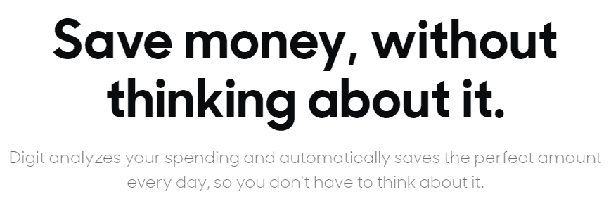
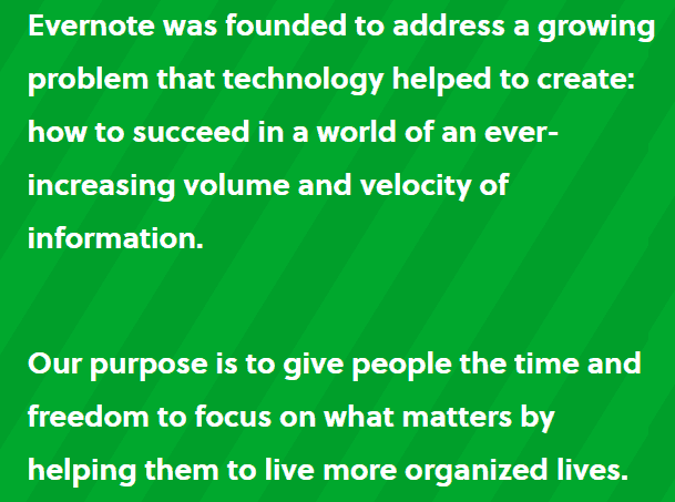
For example, here are the UVPs of a few popular companies:
- Slack – a workplace productivity app
- Digit – an app designed to help you manage your money
- Evernote – an app which I personally love, that helps you stay organized
You want to come up with a UVP for your own business. Then, on your About page, you want to highlight your UVP front and center and explain why it matters.
If you do the Low Hanging System and have a general store, your UVP might be something like…
We aim to make you smile with unique, customizable products that fit your personality.
Here are some additional UVP writing prompts:
- What will people get from your business?
- Why is your business credible and trustworthy?
- Why should people do business with you?
2. Specify who your site is for
Who is your target audience? Especially if you cater to a particular niche, let people know straightaway who your site is aimed at. You can even address those people specifically.
For example, one of my sites sells merchandise with nothing but dog-related designs. So I might start an About page by saying…
First launched in [year], [Name of your store] is a family-owned shop for anyone who loves dogs and puppies as much as we do.
This way, people who visit my About page will know right away if they’re likely to find products relevant to what they’re looking for.
If your site is more general, though, your target audience might be broader, and that still works. You might say something like…
[Name of your store] is a shop filled with unique, customizable goods perfect for anyone who wants to [e.g. feel a little happier, put a smile on their face, find something that fits their personality, celebrate those they love, etc.].
3. Share your story
Your unique store is how you can really dig in and foster a connection with visitors. Your brand story should be about you, not your products or your offers.
Sharing your story isn’t the time to sell your stuff. It’s your time to share a piece of yourself and your values and connect with your audience.
You want to talk about things like…
- How you got started
- When you sold your first product
- When you hit your first big milestone
- When you hired your first employee
- How your business has grown
One strategy I like is to share a timeline of your business’ operations and achievements. It’s a simple but effective format. On my personal website, I share a big list of things I feel really proud of.
Whatever shape your story takes, make sure what you share is unique and personal to you and your business – be human, friendly, and real. You don’t need to sound ultra professional in your About page copy, as that can come across as stiff and boring. Just be you.
4. Communicate clearly and with emotion
To elaborate more on the tone you should take with your About page, you want to speak plainly and use emotionally driven language. Don’t use a lot of jargon, complex vocabulary, or “intellectual” words.
You might think it sounds smart. But really, it’s a turnoff for readers and won’t lead to as many connections. We’re all human here and looking for connection. So talking to people in a more emotional way lets them feel closer to you.
Here are a few examples of intellectual words – and what you should say instead:
- Assist (intellectual) – Help (emotional)
- Donate (intellectual) – Give (emotional)
- Immediately (intellectual) – Right now (emotional)
- Learn (intellectual) – Find out (emotional)
- Inform (intellectual) – Tell (emotional)
- Purchase (intellectual) – Buy (emotional)
(To see a bigger list of words, click here.)
You should also avoid any industry-specific terms and focus on making your page as easy-to-understand as possible.
5. Put a face to your business by including a profile shot or a photo of your team
Including images of yourself or your team (if you have one) is a fantastic way to humanize your business and foster a connection with your customers.
When visitors see your face, your business is no longer just a business. People will know they are dealing with a real-life person – you.
Plus, people’s eyes are naturally drawn to faces, especially smiling faces, which have been shown to increase people’s perceptions about brands and products.
On one of my business’ About pages, I include four images and two videos. In addition to showing myself and my team getting along and enjoying ourselves, these visuals help to break up the text and give readers’ eyes a rest.
I especially love the first image that’s included, which was the CustomHappy team back in 2016…
…It shows my team interacting as more than just co-workers. And there’s a family vibe to it, which is what the culture at the warehouse is like, and my customers enjoy and relate to that.
6. Let visitors know what goes on behind the scenes
Transparency is a very appealing quality to customers. More than ever, people are curious about things like what materials are used to make the products they love and how businesses treat their employees.
Not only do people want to purchase great products, but they also want to support great businesses that treat people well and do great things.
You can achieve this by sharing pictures or videos of things like your workspace or new ideas you’re working on.
In the About page that I mentioned earlier, I include a video tour of my warehouse, which shows how designs are printed and put on products as well as how the products are packaged.
7. Include where you’re based (e.g. Philadelphia)
Again, this lets people get to know you better. Plus, it’s a way to form an instant connection with any customers who are from the same area.
I recommend sharing both where your business is located and where your products ship from in your About page.
This is another means of fostering transparency, because a lot of people worry about shipping times. But if they know upfront where your products ship from, that knowledge can lessen those concerns.
8. Add a call-to-action
This a great tip and something most people don’t do.
After visitors read your About page, what do you want them to do next? You want to offer guidance here and not leave people hanging.
So encourage your visitors to take action. This could be something like checking out your store, filling out a contact form, or just saying hey on social media.
Here are a few examples of calls-to-action you might include at the end of your About page:
- Visit our store now to see our fantastic selection of mugs and t-shirts. [insert link]
- Fill out our contact form and we’ll be happy to answer any questions. [insert link]
- Check us out on social media and feel free to say hi anytime. [insert link]
Just give visitors some kind of next step to take.
Also, it’s helpful to include your CTA multiple times throughout your About page. People skim more than they read. So if you want more people to notice your CTA, I recommend working it into your About page’s text near and top and in the middle and then including a visual CTA image at the end.
What do you think of these tips for creating a stronger, more compelling About page for your website? Are there any other suggestions you can share? Leave a comment below and let us know! And please share this post if you found it useful.






6 thoughts on “Want to create a killer “About” page that attracts more customers? Here’s how”
Nice detailed EXPLANATION, Thank you
NOTHING HAPPENS WHEN I CLICK THE PDF LINK.
I apologize; there was a site error and it’s been fixed now. Download away!
Lots of great ideas here to really flesh out an about page that I’ll be implementing on each of my natural pain relief websites. Thank you, Rachel!
Very good info.
But the link to download the pdf is broken.:)
Thanks.
Also the Comment box will only accept All caps. ??
I apologize; there was a site error and it’s been fixed now. You can download away!
I’m not sure re: caps but your comment came through w/ normal caps. :)